In line with the CSU illustrative style, the College illustration look is clean and modern. Our iconography is designed with an outline aesthetic, with thin lines and limited detail accents. These icons can be used in any color, but the white space integral to this design should remain in place. Limit the amount of fill color.
The University launched a new Find Your Energy brand in Fall 2023 and created a FYE CLA Brand in 2025. Reference the Communicator Toolbox on the CLA Hub for the most current brand guidelines.
The content below is being kept as a reference for CLA websites still using the 2020 VBL. We appreciate your patience as we update all CLA websites to reflect the new university-wide brand.
Iconography
In line with the CSU illustrative style, the College illustration look is clean and modern. Our iconography is designed with an outline aesthetic, with thin lines and limited detail accents. These icons can be used in any color, but the white space integral to this design should remain in place. Limit the amount of fill color.
Icons are quick, visual guideposts that allow readers to skim with ease. Icons should lean on universal symbols to aid in comprehension without requiring extraneous detail. Icons are ideal for directional signage, web navigation, and mobile interfaces. They can also be helpful when photography is not available.
Stamps & Patterns
For additional visual interest, illustrative patterns and stamps were developed for the 2020 VBL. With fluidity and direction in mind, the illustrations below can be used strategically to draw the attention of a user or passerby to key content.
Stamps
Similar to icons, stamps are standalone graphics that can be placed within a communications piece to break up content sections or add a pop of color. They are best used in body copy heavy materials or paired with another visual element.
Example
Similar to icons, stamps are standalone graphics that can be placed within a communications piece to break up content sections or add a pop of color. They are best used in body copy heavy materials or paired with another visual element.
Patterns
Patterns add visual interest and can be used to enhance a design when a photo or icon is not appropriate or available. Patterns that are tied to a brand consistently enhance a user’s recall and brand recognition, so they can be a powerful visual cue.
The patterns designed in the College VBL are seamless patterns, meaning they are designed to be stacked next to each other to create a clean, repeating motif. They can be used in any color, though be careful to not have pattern distort text.
Example
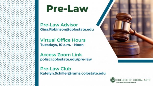
In a promo graphic for Pre Law, the repeating pattern is used to fill white space and informed shape of the imagery and information.
